AD ACTA Translation needed a corporate identity that clearly reflected its core mission: facilitating communication across Switzerland’s language regions. The challenge was to create a brand that feels professional and trustworthy, while visually representing connection, cultural mediation, and linguistic precision. The identity also had to be scalable and consistent across digital platforms, social media, and business materials.
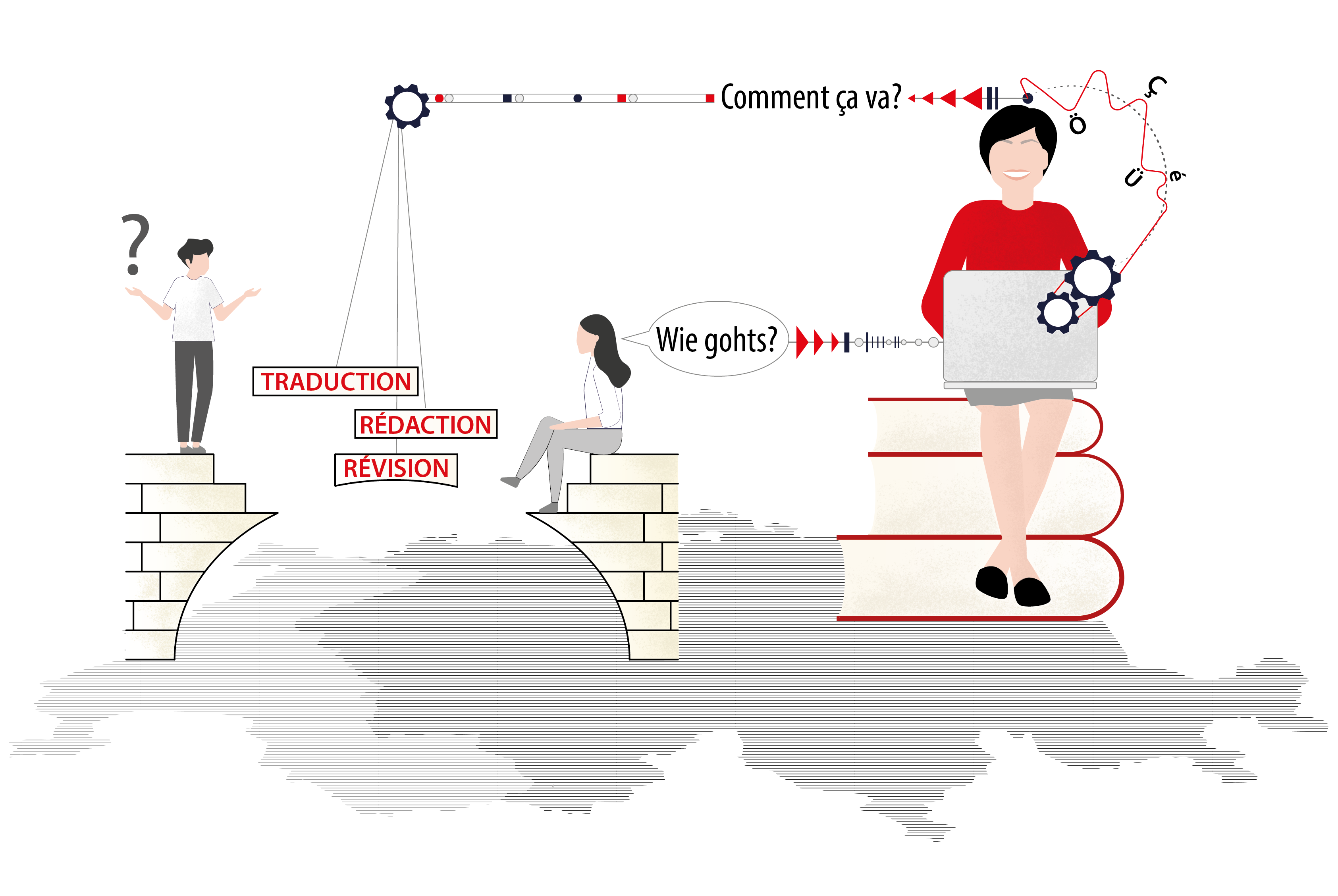
I created a stylized, geometric letter “A” composed of mirrored shapes, suggesting both pens and two voices in dialogue. The logo visually balances the two linguistic sides and symbolizes the bridging role of the translator. For AD ACTA’s website and social media, I developed a minimalist, map-based illustration showing two human figures reaching toward one another across a symbolic Swiss landscape, bringing the abstract concept of cultural divide into an accessible visual metaphor. A neutral monochrome palette with small red accents conveys seriousness and clarity, while keeping visual focus on the theme of human connection. Paired with modern, legible type and structured spacing for multilingual content adaptability.
The bold, modern “A” mark instantly communicates professionalism and purpose, making AD ACTA stand out in a saturated industry. The illustration adds a personal, relatable narrative layer that emotionally connects with viewers, whether clients or collaborators. The visual assets scale effectively across website banners, LinkedIn posts, and presentation decks, ensuring coherent brand presence. The branding underscores AD ACTA’s value not just as a translator, but as a cultural mediator, relevant for both private clients and institutional partners.